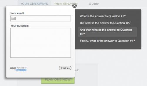
We love SnapEngage, and so do our users. It gives them a warm, fuzzy feeling to be able to get their question answered right away, and it gives us the opportunity to put a personal touch on our support. Wouldn’t trade it.
However, chatting with folks can take up a lot of time, and we tend to get the same few questions over and over. The top 10 questions probably take 90% of our support time. We put these in an FAQ page, but people will still click that big green “Live Support” button without checking the FAQ page (I know I would), and we’ll still have to spend support time pointing them to the right question.
I wanted to put the top FAQ questions right alongside the support widget, so folks would pay attention and hopefully save us some support time. Unfortunately there’s no “standard” way to do this with SnapEngage (without paying them do build it custom), so I decided to take a couple of hours and hack something together myself. It turned out pretty nicely, and here’s how you can replicate it. You can and should tweak this to suit you:
First, you’ll need a list of links to your FAQ questions. I used a list like this:
Then we’ll use jQueryto bind to the click event of the SnapEngage button and slice and dice the widget to inject our list:
There are a few important things going on to note:
- We’re using
live()to bind to the click event since the SnapEngage button gets created dynamically (although it should be created by the time$(document).ready()is called anyway) - We’re using
setTimeout()so the code doesn’t execute immediately. This gives us a slight delay between the time the chat widget is rendered and the time we show the FAQ’s. It’s a nice little trick to draw attention to them without being obnoxious. - We animate (“slide out”) the list for the same reason: it’s a subtle way to draw attention.
- We’re using jQuery Easing for nice, smooth animations.
Next comes the Styling. You can and should style to fit your site, but here’s the core CSS you should include needed to make everything work properly:
The rest of the CSS (that makes it all fancy-like) is too long to embed here, but it’s on GitHub. Feel free to totally steal it.
Heres’ the result on our dashboard page:
Sweet! I’d love to hear any thoughts you have on the approach or how it could be better.
— J.R. (@runningskull)
Related articles
- Getting Paid case study: SnapEngage (reemer.com)
- jQuery SuperBox! (amitsonikhandwa.wordpress.com)

