I love me a good blog, but I hate me a poorly designed blog. If I have to click around more than two times to find what I’m looking for then I’m out. If the design is a little too reminiscent of the 90’s then I’m going to question the relevance. The same is true for most readers. There are millions of fish in the sea, and it’s your job to make sure the reader chooses you.
If one of your goals is to work with brands and gain sponsorship, you definitely need to have a killer site. As I mentioned in a previous post, your brand has to complement their brand. A sleek, modern company isn’t going to partner with a blogger using clip art to style their site. Honing in on what your personal brand represents is essential to getting the readers and partnerships you’re after.
I’m sure you’ve heard the quote “good artists copy, great artists steal”. Well, I’m not saying you should rip off someone else’s site, but there’s a lot of value in perusing the internet and finding inspiration. Make a Pinterest board of your favorites! For me, I appreciate simple, clean sites:
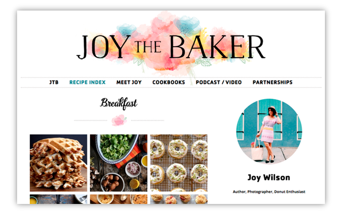
Joy the Baker – ‘On Joy the Baker you’ll find sweet and savory seasonal recipes, a few cocktail recipes, and a sprinkling of the books I read, and the lipstick that I happen to be into.‘ (visit their site)
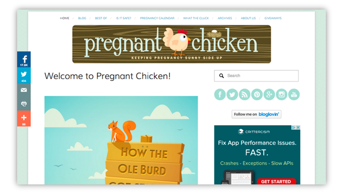
Pregnant Chicken – ‘Pecking away at the myths of pregnancy and keeping it sunny side up.‘ (visit their site)
Southern Plate – ‘Christy Jordan’s beloved recipes from her deep south heritage along with family favorite dishes that are easy on your budget.‘ (visit their site)
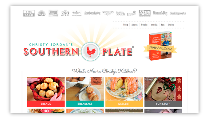
Easy to search, easy to read, and while they may have ads, they’re not overly distracting. There’s obviously a similar vibe going on. It may not be your style, and that’s a-ok, but you can at least appreciate the easy navigation. They all have search bars and easy to use menu options. If I want to find out a little more about the author, I shouldn’t have to guess where to look.
Your Site’s Design
Unless you’re a triple threat unicorn (designer/developer/marketer), you probably need some help getting your site up to par. Thankfully, there are plenty of tools on the internet at your disposal. I know you probably put a lot of work into your site’s presentation, so your opinion will be biased but try to take an objective view. If you can’t do that, ask a friend for criticism. If your friend tells you that your site is embarrassing, hold onto them. True friends are hard to come by.
Themes. I don’t even pretend to be a designer. If I have to set someone up with a new blog, I install a paid theme. It saves everyone the embarrassment of my elementary photoshop/coding skills. You can find some free themes out there that aren’t bad, but it often takes some quality customizations to get a slick looking site.
Make the investment in a paid theme if you suffer from a case of ‘ugly site’ syndrome. Three sites you might want to check out for great paid themes are ThemeForest, Elegant Themes, and Creative Market. Most themes are easy to use and offer drag-and-drop features that make setup a breeze.
Logo/Header Image. Not every blog has or needs a logo, but if you do have one, it better be good. I stumbled upon a site the other day that had a decent overall site design, but the header was crazytown. It reminded me of a hoarder’s closet. It automatically gave off a weird message and detracted from the post’s content. If you’re interested in getting a logo designed by a professional, check out 99designs. Designers submit designs for your site, and you only pay if you like it.
Photos/Videos/Infographics. Since people spend a good chunk of their day consuming content, you have to make your site easy to digest and easy to share to avoid reader fatigue. I don’t care how sophisticated your readers are, everybody loves pictures. If they’re photos, make sure they’re big, clear, and have great lighting.
Posts with grainy, dark photos are worse than posts without photos. Videos are more personal and are a helpful medium when you want to connect or have a discussion with your readers. It’s always cool to see and hear the person/people behind the blog. Infographics are a great tool when you need to explain results or demonstrate a process. Visual learners will thank you.
Your Site Mechanics
It’s embarrassing to admit how ticked I was when some of my favorite blogs changed up their sites to include the ‘Read More’ button. You know the one. You’re gleefully making your way down a post when you have to slam on the brakes to “read more after the jump”. Well, as much as I hate it, I understand it. This elusive button can provide you with much needed analytics like exactly how many people are reading a specific post as well as additional page views. As it turns out, I haven’t stopped following any of the bloggers. I like the content, so I’ll click the button.
Determining which mechanics work best for your site will be a trial and error endeavor but definitely worthwhile. In my next post, I’ll discuss how to measure the success of your features. You have objectives and your readers have objectives. Finding a combination that works for everyone is where you hit the jackpot.
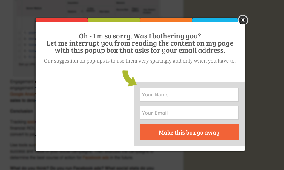
Pop-ups. Hands down the most annoying thing on the internet besides comment trolls. But again, they work for some sites. The closest I ever came to unfollowing one of my favorite bloggers was when they redesigned their site to pop an email subscribe box. I was already subscribed with Feedly, so it was really annoying to skip it every time. My suggestion on pop-ups is to use them very sparingly and only when you have to.
Menu/Buttons. A poorly designed menu is kind of like walking into someone else’s kitchen expecting the cups to be in one cabinet and then they’re not. Your visitors should know what to expect before they get there. As for buttons, make them clear, make them obvious, but don’t make them the bulk of your site. You should limit your site to two CTAs per page.
HTML/CSS. I know I said I’m a coding novice, but I do have some skills that have saved me a lot of time. If you’re running a website, I guarantee you’ll want to adjust something at some point. Instead of begging your tech savvy nephew to check into for you, take a coding class! Yes, it’s easier to get someone to make a quick fix, but believe me, the knowledge will pay off in efficiency. The business folks over here at Rafflecopter have used W3 Schools with great success. I took both the HTML and CSS courses through Codecademy, and it ended up being really enjoyable. Now I know things.
Site design and mechanics are essential pieces to building a respectable online presence. When you reduce friction for your users, they’re able to dive deeper into your content which is the ultimate goal. The book Don’t Make Me Think is a trusted source for creating memorable online experiences. It is definitely worth your time! At the end of the day it’s your site, so do what makes you happy. But if what makes you happy is readers and business development, then start optimizing.
Have you seen any sites with great design? Share the love and list them below!
Pingback: A/B Testing: How to Improve Your Site Engagement()
Pingback: 5 Blogging Mistakes and How to Avoid Them | Rafflecopter()
Pingback: The Top 10 Most Popular Rafflecopter Blog Posts of 2015()
Pingback: Digital Sharecropping: Control Your Own Content | Rafflecopter()