The peer editing process can be awkward. Throughout the years I’ve asked many friends to edit my content pieces, and on several occasions I’ve disregarded their suggestions entirely. They weren’t bad, they just weren’t my style. “I would never say that. I would never say that like that.” If I’m going to put my name on something I want it to represent my style, my brand.
Every brand needs a style guide. You have to define your voice and keep it consistent—especially if you have multiple writers tackling your content. Here at Rafflecopter, we have four people who write for our blog. That’s four opinions on the Oxford comma, four ways to format a blog post, and four opinions on whether I should be using 4 instead of four.
A style guide seems rigid and maybe even a little “corporate”, but it will improve your brand’s image and save your writers from the eternal struggle of deciding between an em dash and a semicolon. Let’s talk style, grammar, and how many spaces should be after a period.
1) Determine Voice and Style
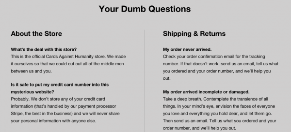
Here’s a shot of Cards Against Humanity’s FAQ page. If you’ve ever seen the cards in this game, you can appreciate the congruency between the product and website. The voice is snarky and the tone is matter-of-fact. They sound strangely approachable.

It’s important to define your voice. Think about how you want to be perceived and what fits with your company’s personality.
Be clear
There’s a lot of wiggle room when creating a style guide. But one thing you shouldn’t debate is getting to the point. When writing a blog post or a marketing email, say what you need to say in the fewest words possible. Most people have fifteen tabs open right now, they don’t have time to sift through the nonsense. If the word isn’t essential to your sentence, take it out.
Be approachable
Writing in the first person is an easy way to connect with your audience. Readers are interested in your personal experience and opinions even if they disagree with you.
A first person approach is a good way to maintain a conversational tone. Readers feel more engaged and are more likely to stick it out to the end of the piece. But don’t overdo it—it’s not all about you.
2) Select Usage Preferences
Setting the standard for grammar and usage is necessary for public content. Here at Rafflecopter, we loosely reference the AP Style Guide. However, if it makes sense for us to break the rules, we’re going to break the rules. We’re rebels like that.
Other guides to consider for your business:
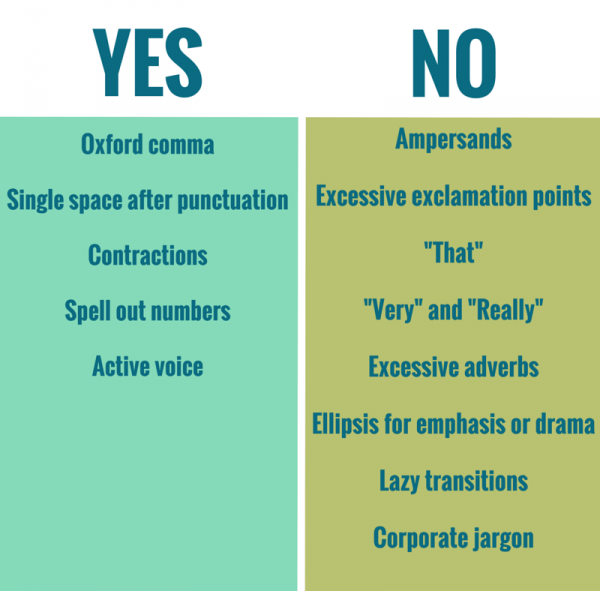
Be sure to highlight common issues in your style guide. We have a ‘yes’ and ‘no’ setup at Rafflecopter for easy reference.

Now, if you go back through our blog, I can guarantee you will find violations of this style guide. It happens, and we are sorry.
3) Establish Post Format
Formatting a blog post seems like an afterthought to most contributors. Who cares if you’re using bullets, numbers, or dashes? Your readers. Jumping around with different formatting makes for a confusing reader experience.
Scannability
Nine out of ten times I will scan a blog post for the highlights. I still find satisfaction in the content I’m consuming. I just don’t have time to read every single word. Most people have a similar habit, and you have to cater to their behavior if you want to draw the right crowd.
Formatting best practices:
- No more than four sentences in a paragraph
- Use lists, photos, and screenshots to help break up walls of text
- Italicize or bold key points throughout your piece
Section Titles. Should you use h2 or h3 for the text size? When should you indent? Every site contributor will be inclined to organize their posts using a unique format. You have to set the standard and stick to it otherwise your site will look chaotic.
Typography. Be consistent. Choose a typeface and height that’s easy on the eyes and use it throughout your whole site. 14-16px is the most comfortable for web reading, and Helvetica and Arial are popular choices for style.
Lists. When it comes to lists, you need to choose your symbol. We’re of the round bullet persuasion over here, but some people prefer dashes. Again, it doesn’t matter. Just pick something and stick with it. Also, decide whether you should put periods at the end of a list items.
4) Set the Standard for Images
Use them and use them well. Did you know posts with photos get viewed 94% more than those without? It goes back to scannability. If you can explain something in one image instead of a whole paragraph, do it.
Image best practices:
- Be consistent with your image sizes
- Bigger images perform better
- Do not link images unless you’re directing to more information
- Cite your source
5) Use Web Tools
When I first started writing, I had Webster’s Dictionary and Encyclopedia Britannica in my tool belt. I’m not sure how I survived. But ever since the internet came about, we have a million different tools at our disposal. Here are a few of my favorites:
Hemingway App. This app almost feels like cheating. It will highlight all of your passive voice violations as well as excessive adverb usage, and it will provide a readability score.
Most content creators will tell you to keep your readability score below the tenth grade. The first time someone mentioned this to me I was resistant. I didn’t want to dumb down my writing. What would people think?? But you don’t have to start writing like a caveman to increase readability. Word length, sentence length, and word choice are the main variables in calculating readability. Be bold and be clear.
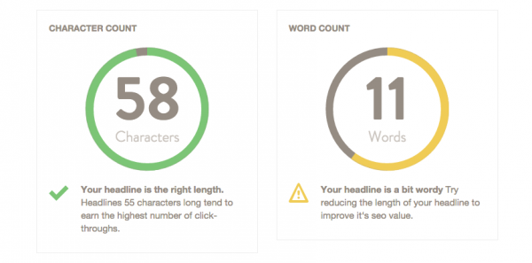
Headline Analyzer. Often overlooked, headlines are a huge component of your content’s success. It doesn’t have to be cringe-worthy à la BuzzFeed, but it needs to be clear and convey the article’s worth. The Headline Analyzer is an easy way to check the effectiveness of your title.

As you can see, my initial title idea was a bit “wordy”.
Creative Commons. Stock images ain’t easy. They’re the epitome of all that is wrong with poorly designed websites, but they’re sometimes a necessity. If you have to use them, Creative Commons is a good place to start. They categorize images available for commercial use and even break it down by editable images. Spicing up stock photos is a good way to avoid the jarring—often cheesy—perfection of the subject.

HubSpot: Hilarious Examples of Stock Photos
Check out Neil Patel’s post on images. He does a good job of breaking down the different types of image licenses and how to tread carefully in the licensing world.
Canva. Designers are a hot commodity and not everyone has access to one. Canva allows you to create quality images with a short learning curve. This is a good option if you need to spice up your headline images, or if you need to create an infographic. Most features are free.
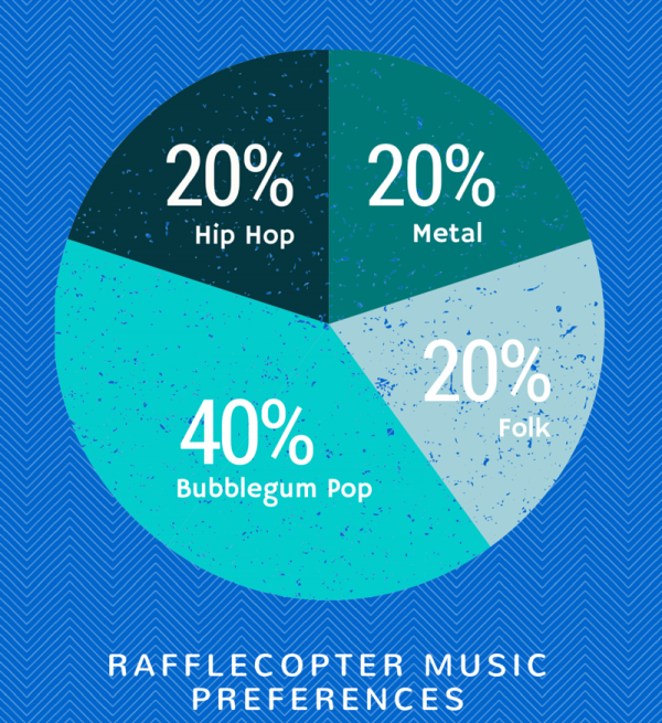
I made this graphic in five minutes. If I spent ten minutes then it would be even awesome-er. If I can do it, you can do it.

Conclusion
A style guide will help maintain the quality of your content without crushing creative freedom. You don’t have to have a degree in English to create a content style guide, you just have to have high standards.
I’d love to know what’s in your style guide. Share in the comments!
Pingback: 5 Takeaways from MozCon 2015()