This is a guest post by Mathew Sisson, who hails from Boulder, CO and is the Designer for The Daily Dot. In his spare time he takes on the occasional freelance project, snaps pictures, and brews root beer. Follow his blog here, or follow him on Twitter.
___________________________________

I’m going to be honest with you: design is everything when it comes to a blog. But there are so many components to a good design, it’s almost a bit overwhelming.
Luckily for you, I have a long list of bookmarks I use on a regular basis that will help point you in the right direction to better understanding why design is so crucial in not only getting people to your blog, but to keep them reading.
Today, we’re going to learn about typography, how it plays a role in the readability of your blog, and four resources that you can use at your disposal.
Typography: What You Should Know
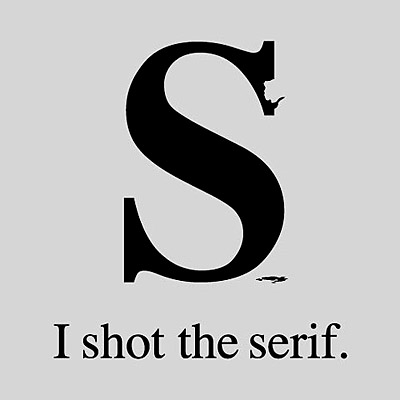
 Typography, by definition, is the art and technique of arranging type in order to make language visible. What does that means for bloggers? It means when someone lands on one of your posts, you’re giving them the best reading experience possible.
Typography on your blog is about as important as having all three legs on a camera tripod. You need to have the perfect combination of font types, color, and size. All of these things create a harmonious experience for people when they are reading through your blog post.
You don’t want to have your reader with their nose against the glass, nor do you want them squinting because the contrast of your background isn’t high enough. There are tons of resources that help you learn about typography and expand your font selection.
Four Free Typography Resources For Bloggers
So… you want to get introduced to the thought of typography in more detail. The web is filled with plenty of resources. To get you started, here are four sites I recommend using as a resource to become more familiar with typography:
1) Type Connection teaches you how well fonts play with one another. This comes in handy when choosing your headline font along with your main content font. Do you know the difference between a serif font and a sans-serif font? If not, it might be worth diving into this tool.
2) Kern Type is another game that allows you to understand the importance of kerning (the spacing in between letters). Have you ever seen a business sign that the letters seemed squished together and hard to read? That was done by someone who didn’t understand the concept of kerning. You don’t want to be that someone.
3) Google Web Fonts is an incredible resource for finding new fonts that can be used across the web. In the Internet’s earlier days, designers were restricted to the font set that came on a users computer when building sites, unless they wanted to use images. The use of images was effective some of the time, but when you have a lot of images loading, it would slow down your site. This ultimately caused a loss of some of your audience due to low patience.
What Google has done with Web Fonts is allow you to download fonts for your personal use or give you an embed code (similar to the Rafflecopter widget code) and place it in the code of your site. Now, instead of worrying about if your reader has a certain font, it’s delivered to them instantly when they load up your site.

4) Colllor is an app that allows you to find colors that compliment one another. This is a task that is almost always overlooked. Not all colors work with one another, and every color projects a certain feeling to the reader. When dealing with the color of your blog’s type, you’re better off with something darker to compliment a lighter background. Obviously, the one that is most common is black on white, because it works.
Bonus Points
People like saving money, and when it comes to something they feel they can do on their own, they do it. There are many things you can do to better your blog, but ultimately, getting help from a designer pays for itself. A great resource to find inspiration and connect with awesome designers is ‘dribbble’.
Dribbble is an online community of designers that houses the best of the best and shows you exactly what they’re working on in detailed 400 x 300 screenshots. If you start checking the popular dribbble shots on a weekly basis, you will begin to learn the current design trends which, in turn, will help you learn how to better the design of your blog.
- (and hey… you can follow Matt on dribbble here for his lastest creations, or follow JR here for occasional sneak peeks of Rafflecopter screenshots)
Design, just like all aspects of the web, is always changing. Keeping up with it in order to keep readers coming back to your blog is important. These are just a few tips that you can use to get started, but the more time you take to learn about design and typography, the better off you’ll be. Until next time… good luck out there!
Related articles
- 10 Interesting Typography Compositions (graphicmania.net)
- Getting a sense of good typography with these web and iPhone games (performancing.com)
- 7 Typography Tools Every Designer Should Know (smashingapps.com)

Pingback: Rafflecopter Alpha Invite Codes | Rafflecopter()
Pingback: Raffle fonts | Gofites()